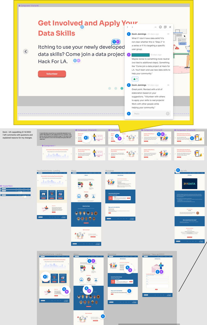
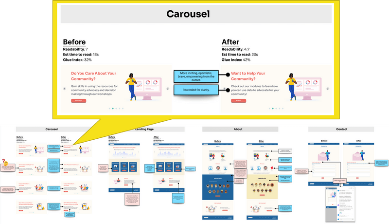
Following the conclusion of usability studies and survey analysis, I teamed up with our UI designer and a new UX writer to enhance the copy and microcopy. Using Figma for design and Grammarly for editing, we refined the website content to align with our users' natural language. At an all-hands meeting, we presented a before-and-after comparison of our Figma prototype, showing marked improvements in readability and coherence. This collaborative process was well-received and allowed the team to integrate the new copy into the design seamlessly.
Following the conclusion of usability studies and survey analysis, I collaborated with a UI designer and a newly onboarded UX writer to enhance the clarity, inclusiveness, and readability of the copy and microcopy on a project. Our primary tools were Figma for direct edits and commentary and Grammarly for assessing readability and coherence improvements.
I aimed to refine the existing website content to meet our users' natural language needs while integrating the changes into the design process.


The modifications significantly improved readability, coherence, and style, as quantified by Grammarly scores. This, in turn, led to a more user-friendly website, as users found it easier to navigate and understand the content. The Figma commentary method facilitated a transparent and collaborative revision process, allowing the entire team to follow and understand the rationale behind each change.
The presentation of the before-and-after comparison at the all-hands meeting demonstrated the effectiveness of the changes, receiving positive feedback from the team. The modifications made directly in Figma ensured a smooth transition for the designers, empowering them to adopt the new copy seamlessly and aligning the project closer to our users' needs. When my contributions to the project ended, the team was conducting usability tests on the revised prototype to validate the impact of these changes on user experience.